Designing a Community Website That Converts

According to a study conducted by Google and Apartments.com, 7 out of every 10 apartment-seekers begins their search online rather than with an agent. Roughly the same number end up renting an apartment they find online. Surprised? We didn’t think so.
For years, multifamily property managers have been trying to build community websites that cater to the demand for online apartment searching. More than ever, apartment owners and managers are reliant on the web to keep their units occupied and their NOI in the black.
In this article, we’re going to talk about what makes renters want to use an apartment community website. We’ll begin by looking at some stats, and then we’ll turn to a few examples. Before we get started, we need to say a few things about user experience (UX).
UX is arguably the most crucial element in web design. If a site doesn’t cater to its users’ needs in a straightforward, intuitive, and snappy way, they’re gone. Good UX isn’t about aesthetics — what looks good. Instead, it gets into the renter’s head, asks what they want, and designs a site to match. All that to say, the best rental websites are the easiest to use. They give the searcher what they want when they want it, and they do it in as slick a way as possible.
Alright, then, what do renters actually want? If we’re going to put the renter’s needs first, then we need to know something about what those needs are. The following list sums it up in 5 categories:
1. Real-Time Searchability – According to Google’s study, 71% of respondents considered the internet the most up-to-date source for apartments. A great community site, then, needs to offer real-time data in an easily accessible manner.
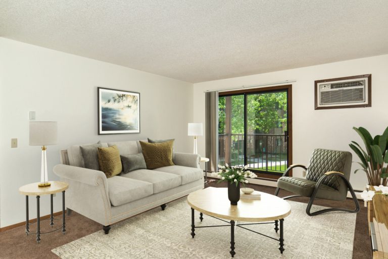
2. Media – Renters have come to expect rich visual content to accompany each apartment listing. This not only helps to sell the community and the unit, but it offers “shareable” content for social media. When visitors share, traffic increases. Speaking of “shareable” media, have you made sure that your image stock is unique and cohesive across your social channels?
3. Reviews – Most renters don’t need a real estate agent to help them find their next place. 8 in 10 do, however, consider reviews important to their search. That’s why strong apartment sites include resident stories and community testimonials. By embedding your social media and search engine reviews directly on your site, you are able to aggregate the verified opinions of current tenants and display them to your leads and prospects in a centralized location. If you have admin access to edit your community’s website, simply embed the code offered by that particular channel.
4. Online Services – 73% of renters want to be able to accomplish basic services online: paying their rent, submitting maintenance requests, etc. Community sites that perform well include a resident portal for helping renters achieve just that.
5. Mobile – Mobile has become a dominant trend in apartment advertising. In 2015, ForRent.com found that 84% of renters searched for apartments online. From an SEO perspective, Google will tank your search ranking if you don’t offer a mobile version of your site. Considering 47% of leads collected on apartment sites come from search engines, that’s a knock your site can’t afford to take.
With these categories in mind, the best community sites will aim to satisfy each in the most aesthetically pleasing and pragmatically satisfying way. What does that mean?
Searchability – Keep your site up to date and make it as easy to use as possible.
Media – Make sure every listing includes easily-accessible photos and/or videos.
Reviews – Embed and place testimonials and reviews in visible spots.
Services – Offer a resident portal as a key element of your value proposition.
Mobile – Use responsive web design to build a site that looks great on mobile.
Who’s Doing it Right?
All of that is helpful in the abstract, but now it’s time to take a look at a few sites which cover these bases well. Each represents a strong blend of the elements we looked at above while offering unique customer experiences.
Sedona Seattle
Phoenix, AZ
Epic Asset
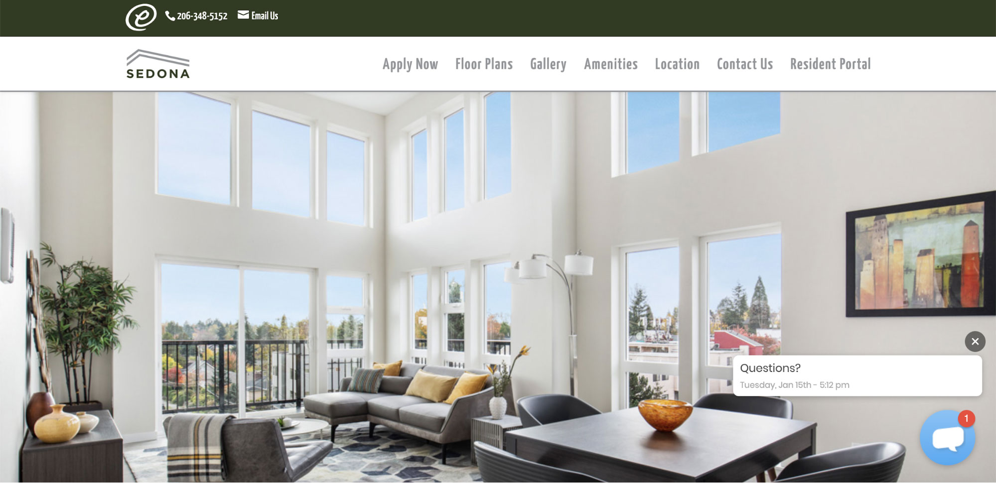
As far as searchability and usability go, Sedona’s website is sleek and easy to navigate. The site’s navigation bar possesses hierarchy, is organized and offers a clear path for renters to find exactly what they’re looking for.
This site makes strong use of media, leading off with a scrollable header and then following with graphic summaries of amenities, and unit shots. There’s enough here to get a sense of the lifestyle this community offers to its residents.
The resident portal is clearly named and located. There is no need to bookmark or save links, and residents can easily pay their rent or request services. Sedona Seattle’s mobile design is a good distillation of the website — with shared hierarchy and easy navigation.
Pro Tip: Knockbot and our Community Pages allow prospects to view available floor plans and self-book tours for those units. When renters are provided ease of use on the front end and you can communicate through their channel of choice, major customer pain points are removed from the leasing process.
Track 29 City Apartments
Minneapolis, MN
Lincoln Properties
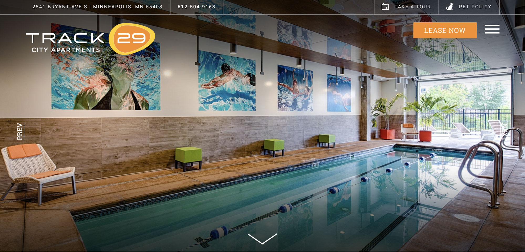
Track 29 offers a media-rich website that immediately captures visitors’ eyes with an automatically scrolling header featuring images of units and amenities. It’s ‘Lease Now” call-out is clear, and the translucent header is a fantastic touch. The ‘Pet Policy’ link at the top right indicates that Track 29 knows what’s top of mind for their demographic in Minneapolis, MN.
As you work your way down the site, a scroll effect keeps the page interesting. A drop-down header helps with the site’s usability, offering ready links to important pages: amenities, floorplans, neighborhood, gallery, and a resident portal. The ‘Lease Now’ call-to-action maintains its prominent spot at the top right of that dropdown header.
Track 29’s mobile website is a strong adaptation of its desktop site. It loses some of the site’s richness, but it makes navigation even easier than its counterpart.
Minnie Flats
Seattle, WA
Thrive Communities
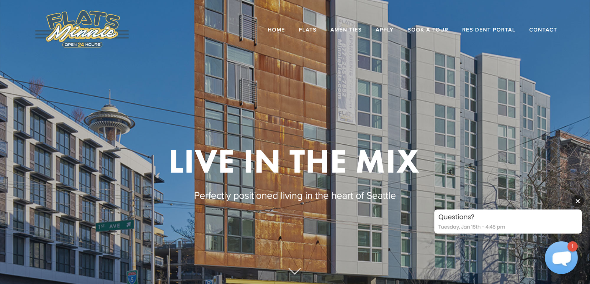
Minnie Flats does a good job keeping their call to action in the bottom right corner and keeping the background clutter-free. The menu bar makes the site easy to navigate, and the floorplan link makes it simple for visitors to quickly check apartment layouts. Its mobile site scores high on usability and clarity.
Conclusion
As we’ve seen above, renters primarily expect 5 things from an apartment website: searchability, media, reviews, services, and mobile accessibility. Give them what they’re looking for, and they’ll stick with your site all the way up to lease signing.
While the examples we shared above mostly deliver on renters’ expectations, none seem to make much (or anything) of tenant reviews. Given stats we saw above, this seems like a ripe area for market differentiation.
Even so, these are fantastic sites that do their job well. As great as they are, though, there is always room for improvement. Let that serve as an invitation: design a beautiful site that goes the extra mile to reach renters, and there’s no reason why you can’t edge out your competitors online.
Learn more about creating an awesome website with our guide to SEO for multifamily.
Related Articles